Natural Products. Thoughtful Labels. A Story Told Through Design

Overview

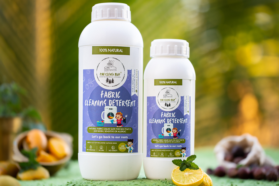
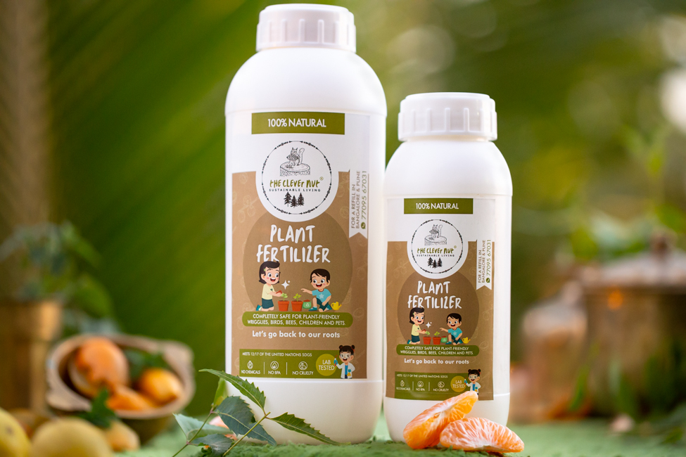
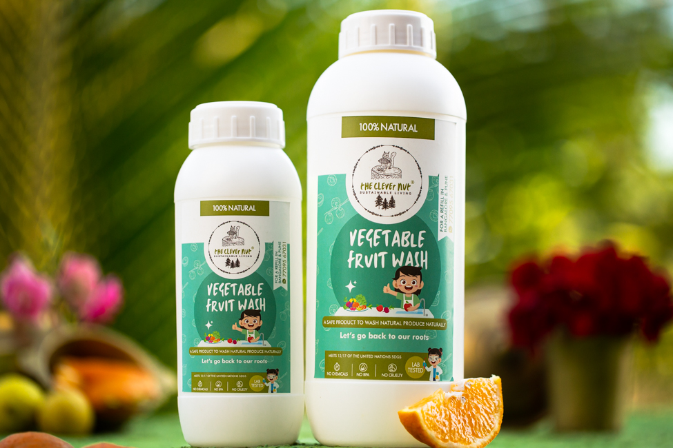
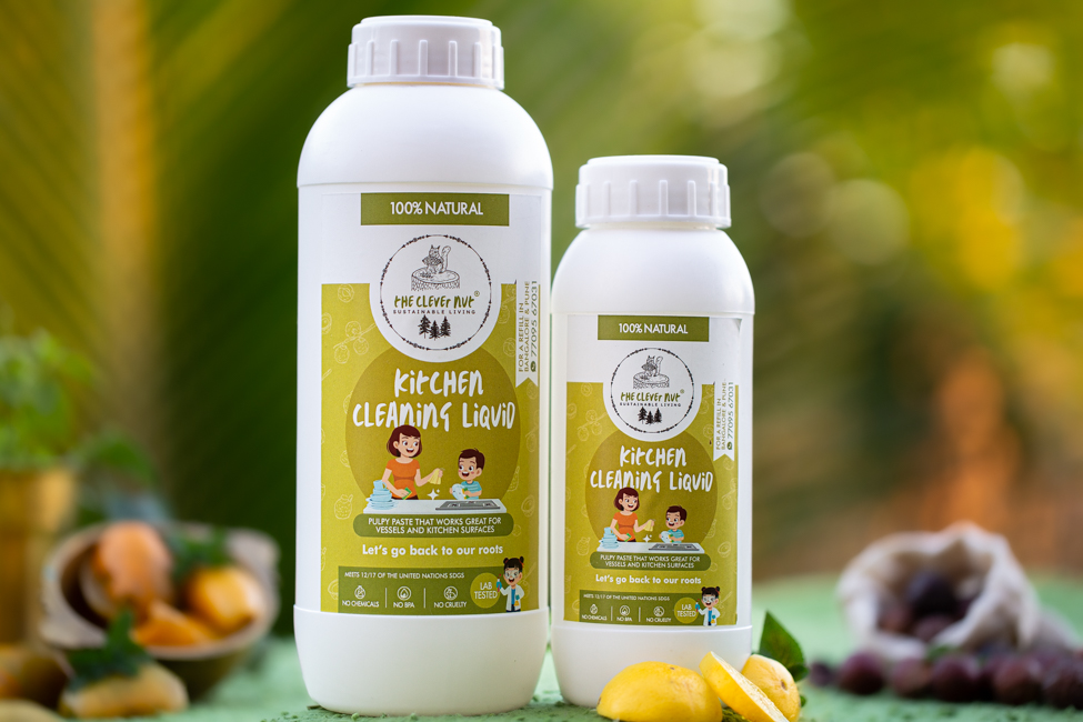
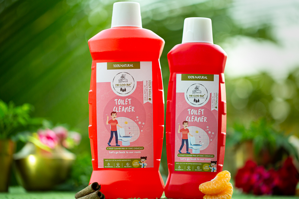
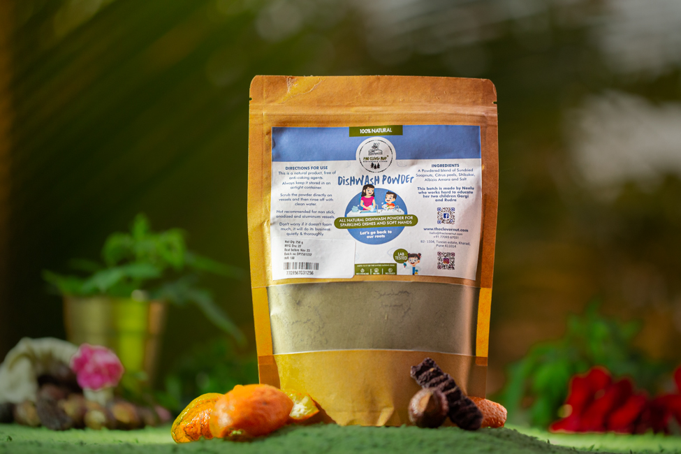
The Clever Nut, a conscious lifestyle brand rooted in sustainability, wanted its product labels to reflect its values, clean, natural, and purpose driven. While the product quality stood out, the visual identity on packaging didn’t fully capture the charm and clarity needed to connect with today’s mindful consumer.

Objective: Redesign the product label system to better reflect the brand’s positioning, simple, sustainable, and trustworthy.

Our Solution

Label System Design

We created a label system that balanced clarity with character, aligning with the brand’s earthy, modern aesthetic.

Illustration Style

An artisanal visual language, carefully curated to evoke craftsmanship without feeling ornate or overdesigned.

Colour Palette

A muted range of soft neutrals and greens to reflect the brand’s sustainable promise and natural product base.

Layout System

Structured, friendly layouts that gave space to product names, benefits, and usage, easy to read and visually calm.

Visual Consistency

A muted range of soft neutrals and greens to reflect the brand’s sustainable promise and natural product base.

Impact / Benefits

  • Gave the Clever Nut’s product range a cohesive, design-forward identity
  • Improved shelf impact while maintaining simplicity and authenticity
  • Strengthened the brand’s visual link to sustainability and conscious living
  • Made the product range instantly recognisable without relying on loud cues